San Francisco's poop statistics: Are we measuring the wrong thing?
In this post, I’m going to cover two kinds of shit. The first kind is feces on the streets of San Francisco that I’m sure everyone knows about due to abundant news coverage. The second kind is bullshit; specifically, the kind found in faulty data gathering, analysis, hypothesis testing, and reporting.
Since 2011, the SF Department of Public Works started tracking the number of reports and complaints about feces on public streets and sidewalks. The data is open and used to create graphs like the one shown below.
Source: Openthebooks.com
The graph displays the year-over-year number of citizen reports of human feces in the city. It certainly seems like it’s getting worse. In fact, the number of people defecating on the streets between 2001 and 2018 has increased by over 400%! This is confirmed by many news headlines reporting on the graph when it was first released. A few examples are:
Sure seems like a dismal outlook, almost a disaster fit for the Old Testament.
Or is it?
The data (number of reports of human feces) and the conclusion drawn from it (San Francisco is worse than ever) makes my measurement spidey sense tingle. I have a few questions about both the data and the report.
Does the data control for the City’s rollout of the 411 mobile app, which allows people to make reports from their phone?
Has the number of people with mobile phones from 2011 to the present increased?
Do we think the City’s media efforts to familiarize people with 411, the vehicle for reporting poop, could contribute to the increase?
The media loves to report on the poop map and poop graph as proof of San Francisco’s decline. Would extensive media coverage contribute to citizen awareness that it can be reported, therefore resulting in an increase in reports?
Is it human poop? (I know the answer to this: not always. Animal poop and human poop reports are logged and tagged together in City databases.)
Does the data control for multiple reports of the same pile? 911 stats have this problem; 300 calls about a car accident doesn’t mean there were 300 car accidents.
Knowing that a measurement and subsequent analysis starts with a well-formed question, we have to ask: are we measuring the wrong thing here?
I think we are!
Perhaps a better question we can answer with this data is: what are the contributing factors that may show a rise in feces reports?
A more honest news headline might read something like this: Mobile app, outreach efforts leads to an increase in citizens reporting quality of life issues
Here’s another take on the same data:
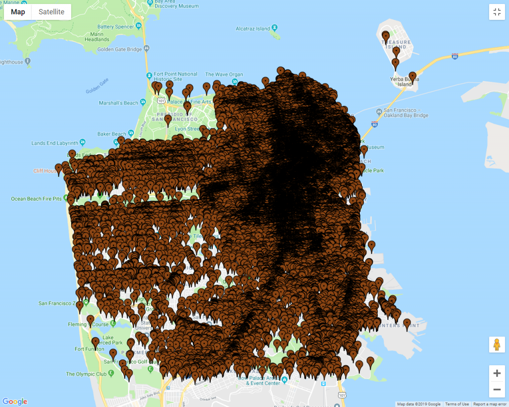
Locations of all poop reports from 2011 to 2018. Source: Openthebooks.com
At first glance, the reader would come to the conclusion that San Francisco is covered in poop - literally. The entire map is covered! The publishing of this map led to this cataclysmic headline from Fox News: San Francisco human feces map shows waste blanketing the California city.
Fox’s Tucker Carlson declared San Francisco is proof that “Civilization Itself Is Coming Apart” and often references the poop map as proof.
Let’s pull this map apart a little more. The map shows 8 years of reports on one map - all the years are displayed on top of each other. That’s a problem. It’s like creating a map of every person, living or dead, that’s ever lived in the city of London from 1500AD to present and saying, “Look at his map! London is overpopulated!” A time-lapse map would be much more appropriate in this case.
Here’s another problem with the map: a single pin represents one poop report. Look at the size of the pin and what it’s meant to represent in relation to the size of the map. Is it proportional? It is not! Edward Tufte, author of “The Visual Display of Quantitative Information” calls this the Lie Factor.
Upon defining the Lie Factor, the following principle is stated in his book:
The representation of numbers, as physically measured on the surface of the graphic itself, should be directly proportional to the quantities represented.
In other words, the pin is outsized. It’s way bigger than the turd it’s meant to represent, relative to the map. No wonder the map leads us to think that San Francisco is blanketed in poop.
I’m not denying that homelessness is a huge problem in San Francisco. It is. However, these statistics and headlines are hardly ever used to improve the human condition or open a dialog about why our society pushes people to the margins. It’s almost always used to mock and poke fun at San Francisco.
There’s an Information Security analogy to this. Every time I see an unexpected, sharp increase in anything, whether it’s phishing attempts or lost laptops, I always ask this: What has changed in our detection, education, visibility, logging and reporting capabilities? It’s almost never a drastic change in the threat landscape and almost always a change in our ability to detect, recognize and report incidents.


